Define a stronger AI visual language.
I focused on how AI-specific cards, charts, and metrics should feel more unified across the product.
Project / 03
A ServiceNow internship project focused on unifying the AI visual language inside AI Control Tower so governance, inventory, and value signals feel clearer, more recognizable, and more scalable.
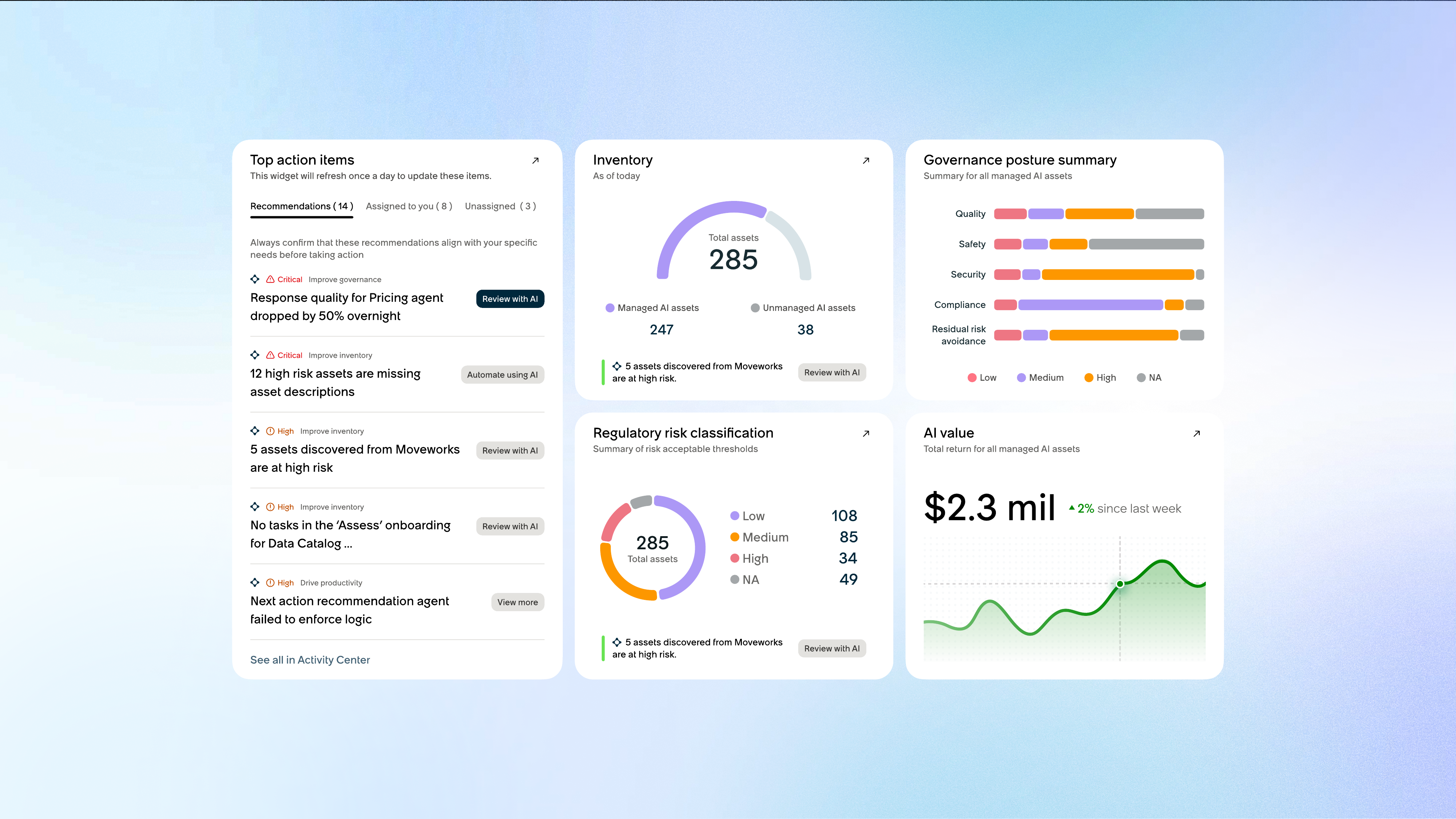
AI Control Tower is a centralized dashboard for monitoring AI usage, governance, and performance across enterprise systems. My role was to make the product feel more consistent by building a stronger AI-specific visual language across its most important surfaces.
The work focused less on adding new features and more on sharpening recognition, improving hierarchy, and making dense AI oversight information easier to parse at a glance.
Discuss this project ↗I focused on how AI-specific cards, charts, and metrics should feel more unified across the product.
The priority was better recognition, clearer hierarchy, and more consistent behavior across dense product surfaces.
The work translated directly into visual improvements across key AI Control Tower modules rather than a speculative concept only.
Challenge
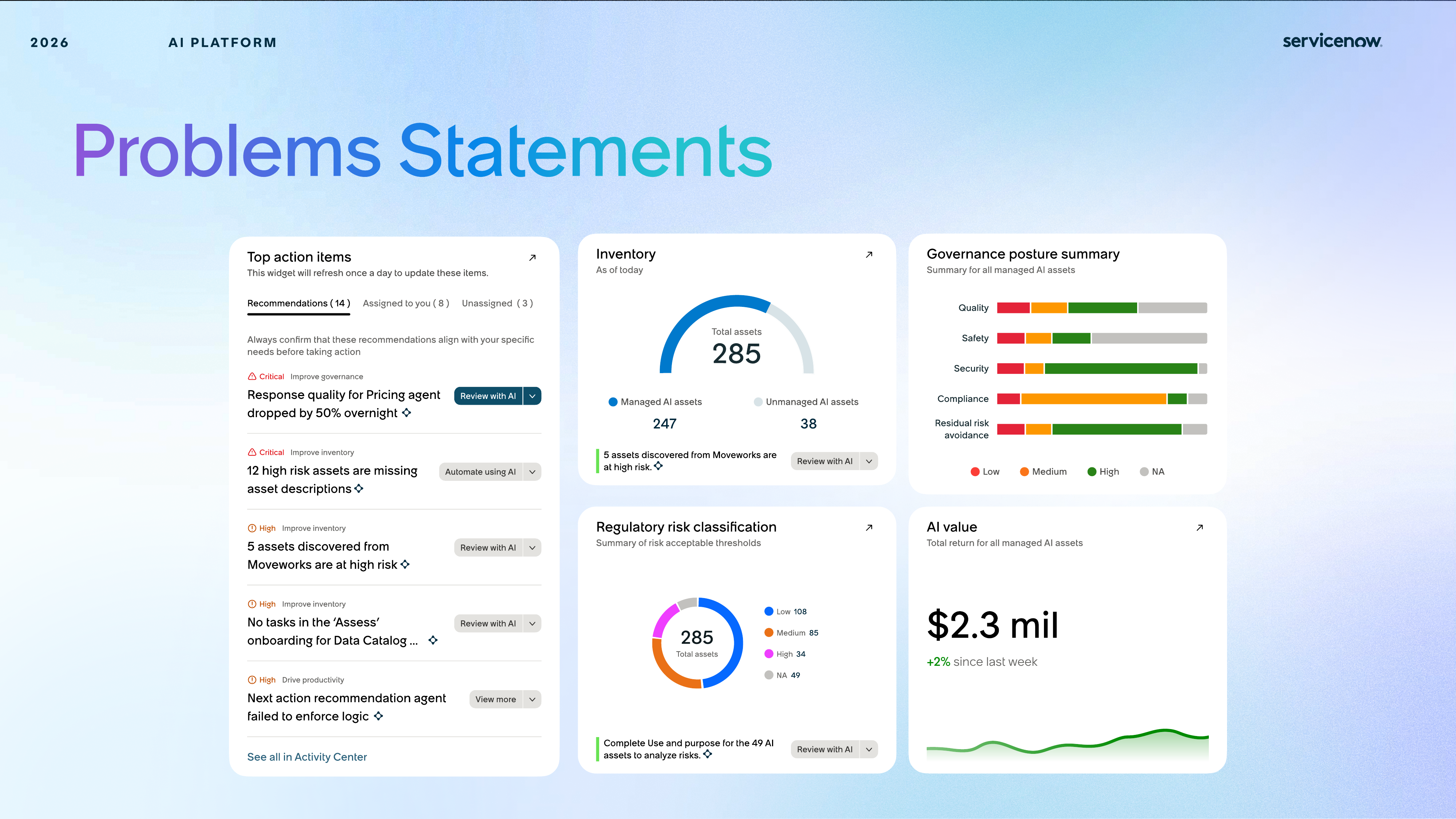
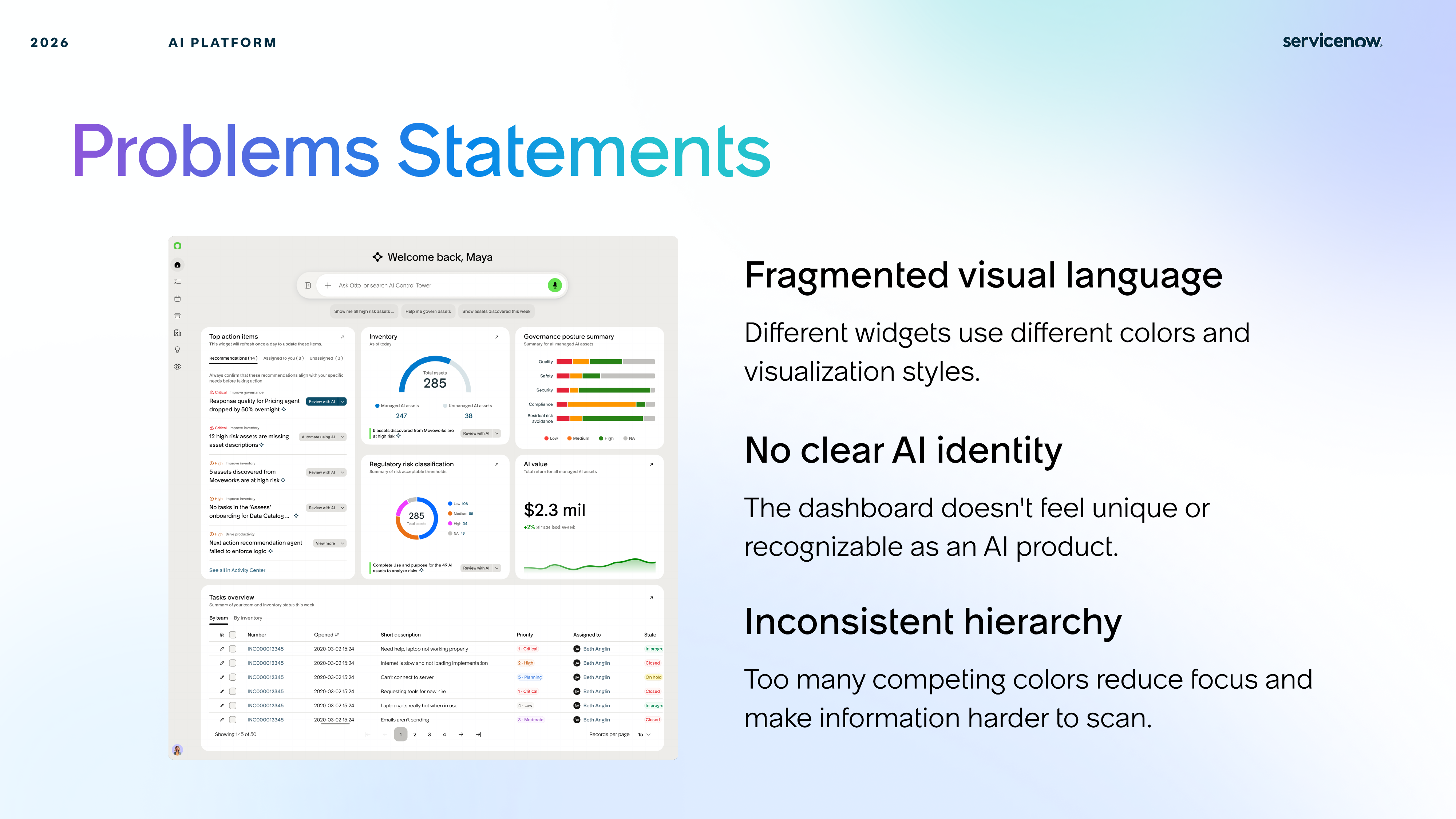
Different cards, charts, and data moments looked like they belonged to different systems. That inconsistency weakened recognition and made the experience feel less cohesive than the importance of the product demanded.
Cards and data modules were inconsistent in spacing, chart treatment, and emphasis, which made AI-specific information feel visually disconnected.
The system needed recognizable cues that could distinguish AI signals from standard enterprise dashboard content without becoming noisy or decorative.
Key metrics like value, posture, and risk needed stronger visual prioritization so users could understand what mattered first.
System Moves
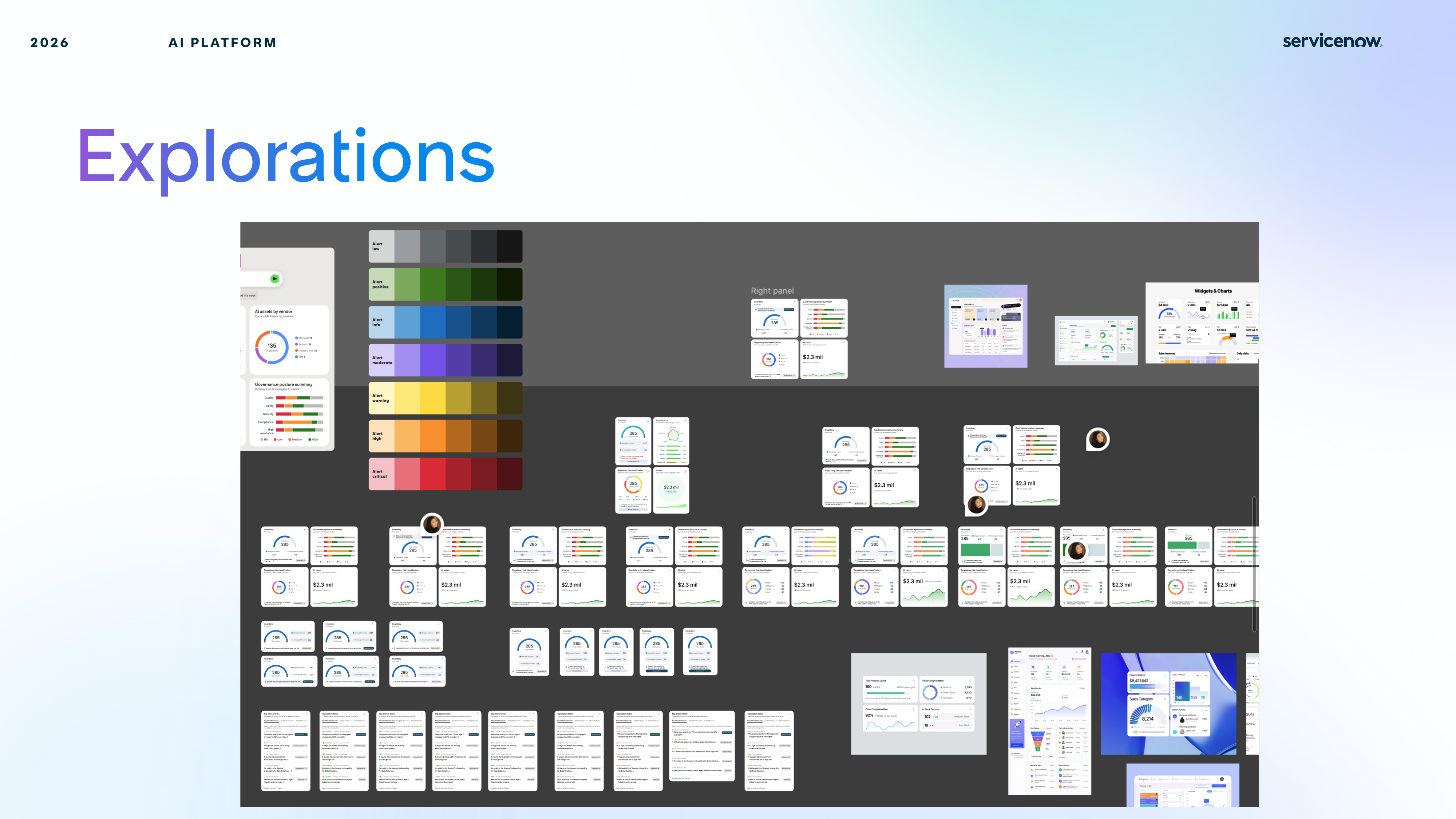
Rather than treating each card as a one-off redesign, I used the project to establish reusable moves for chart emphasis, metric hierarchy, and AI-specific recognition.
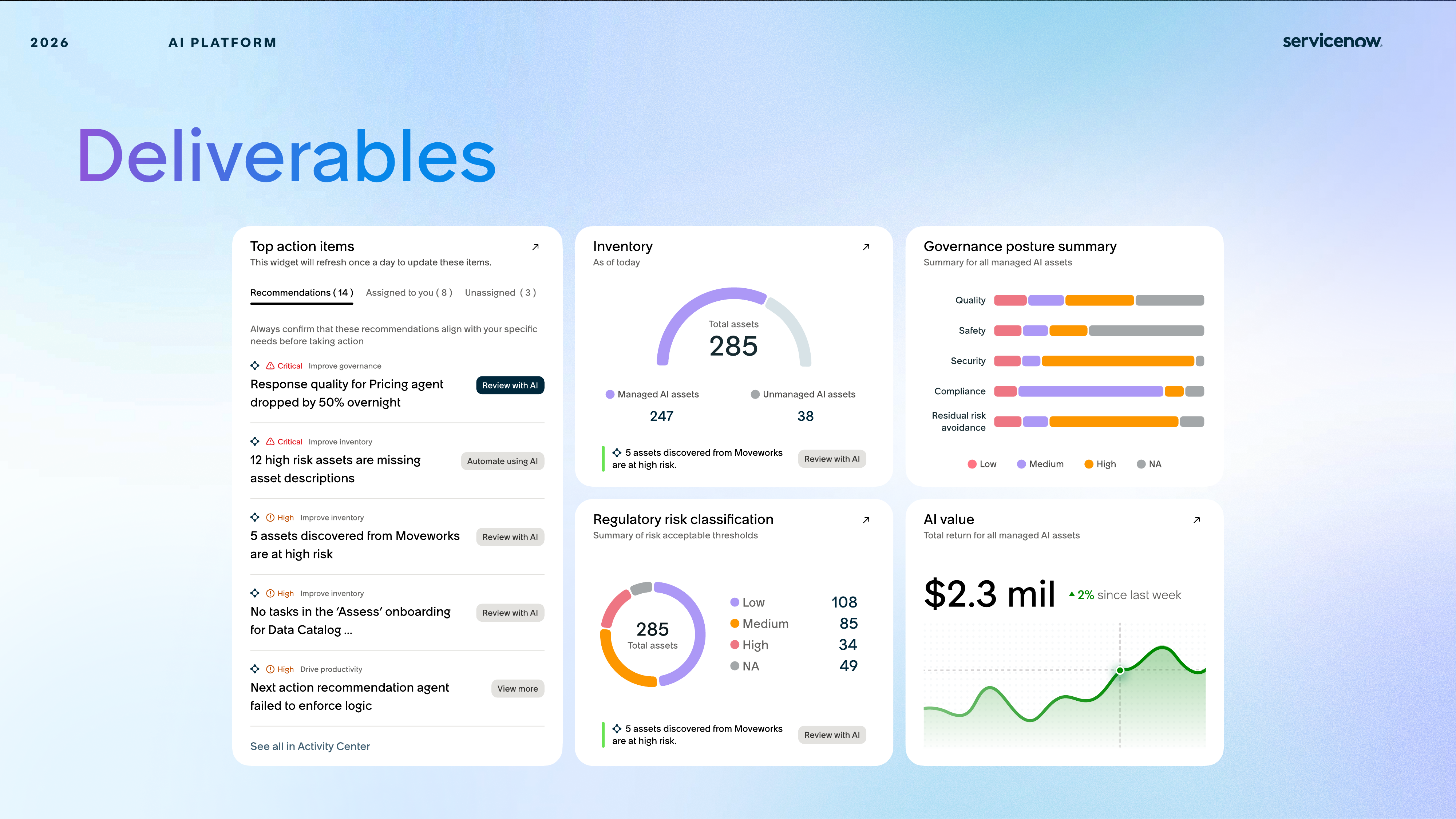
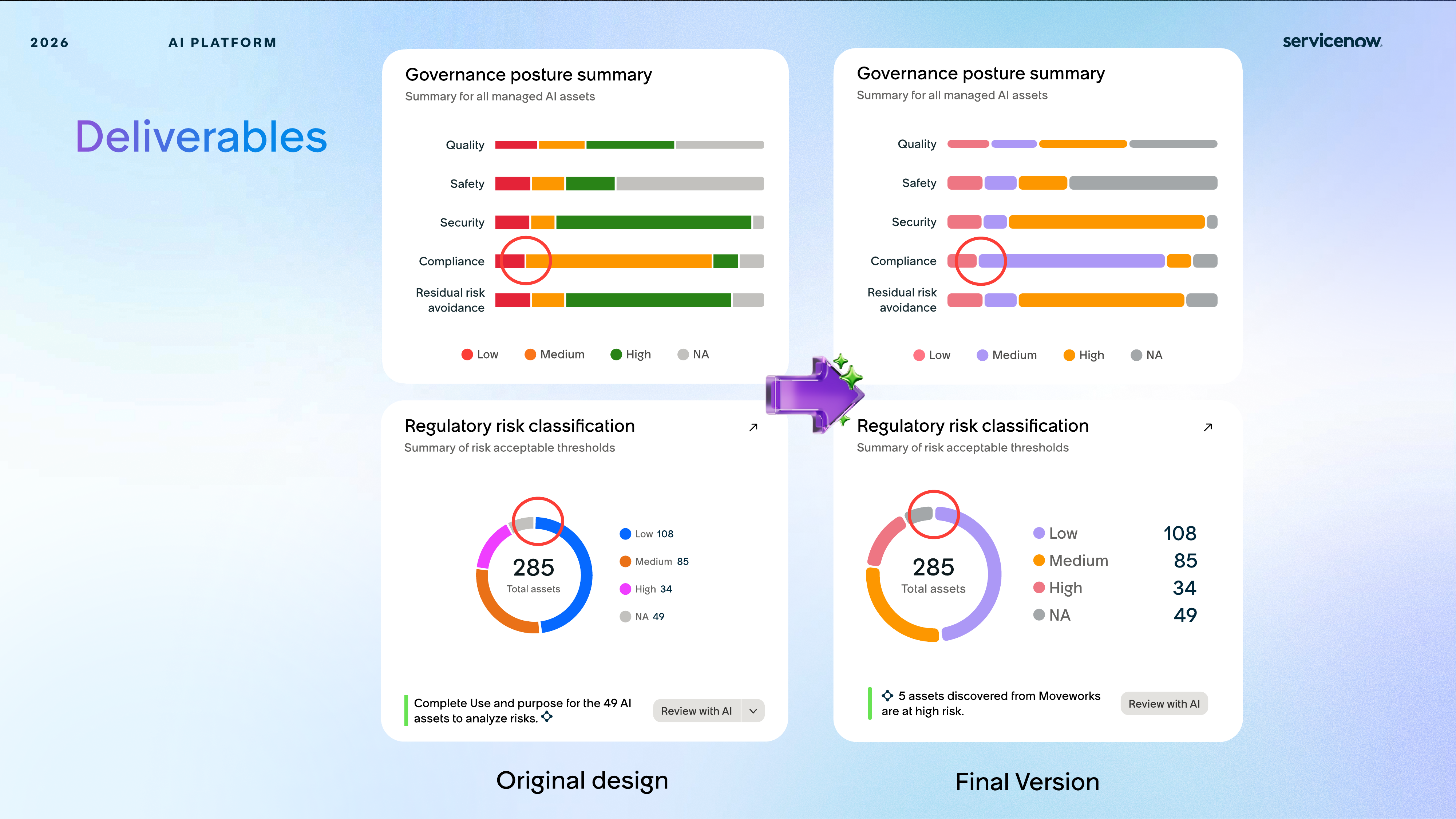
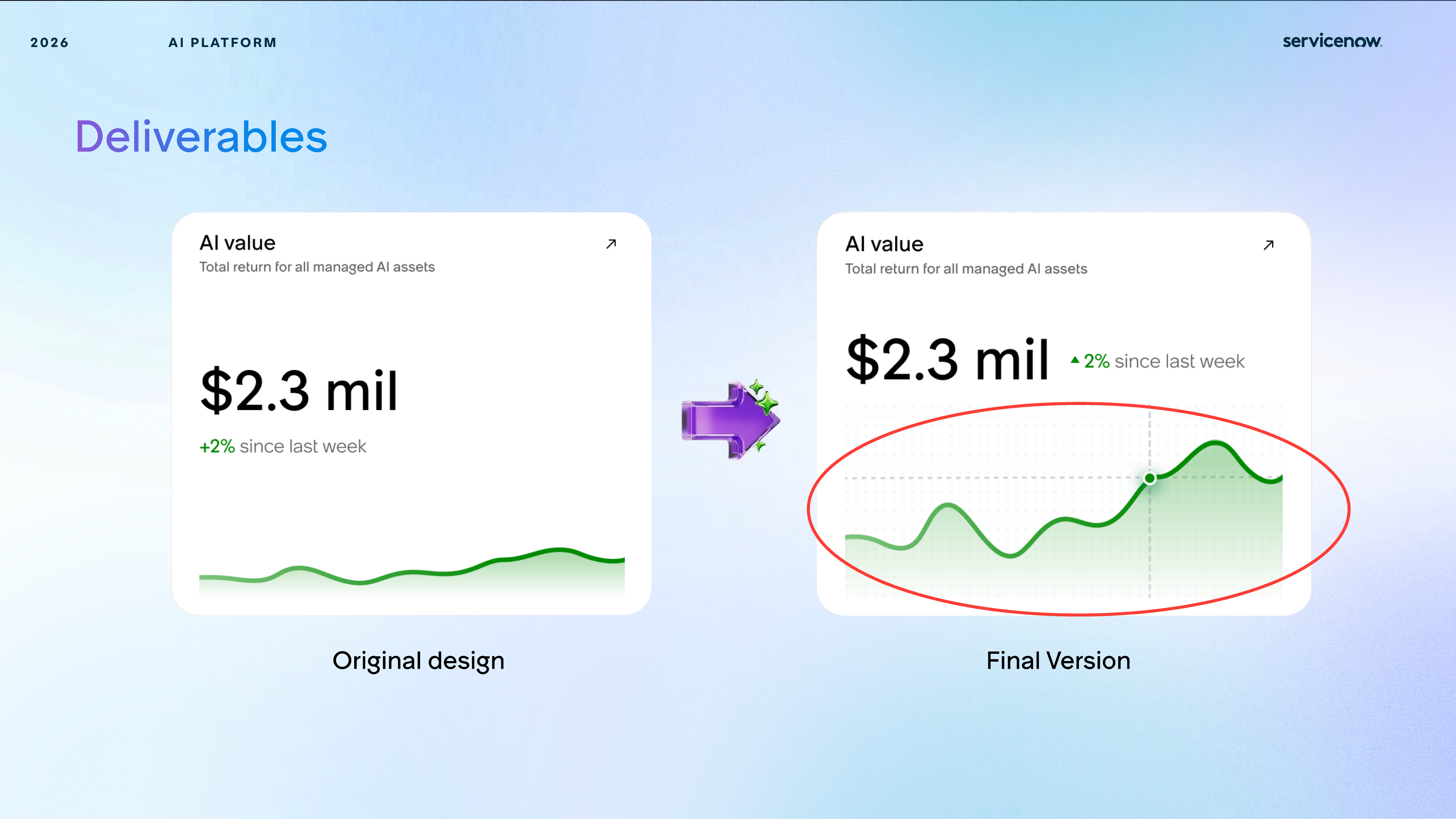
Value, posture, and risk cards were adjusted so headline information landed first, with supporting patterns and trend detail structured underneath.
Graphs and data moments became easier to parse through more deliberate contrast, cleaner trend shapes, and reduced visual ambiguity.
The resulting AI language was meant to scale, so the same logic could carry across multiple surfaces without re-explaining itself.
Principles
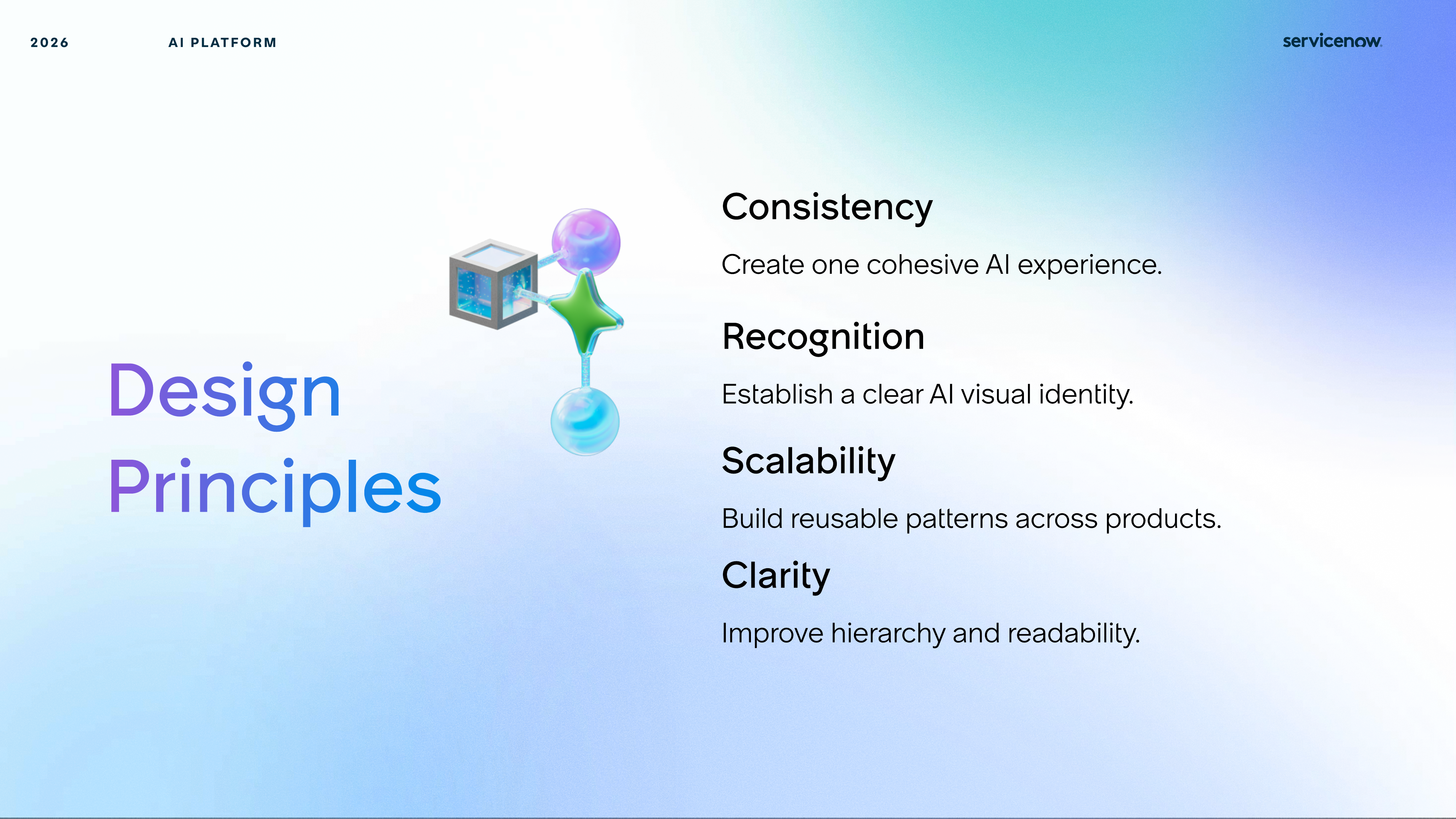
I used these principles to decide how charts should read, how AI cards should feel, and how the overall system could scale across multiple AI Control Tower surfaces.
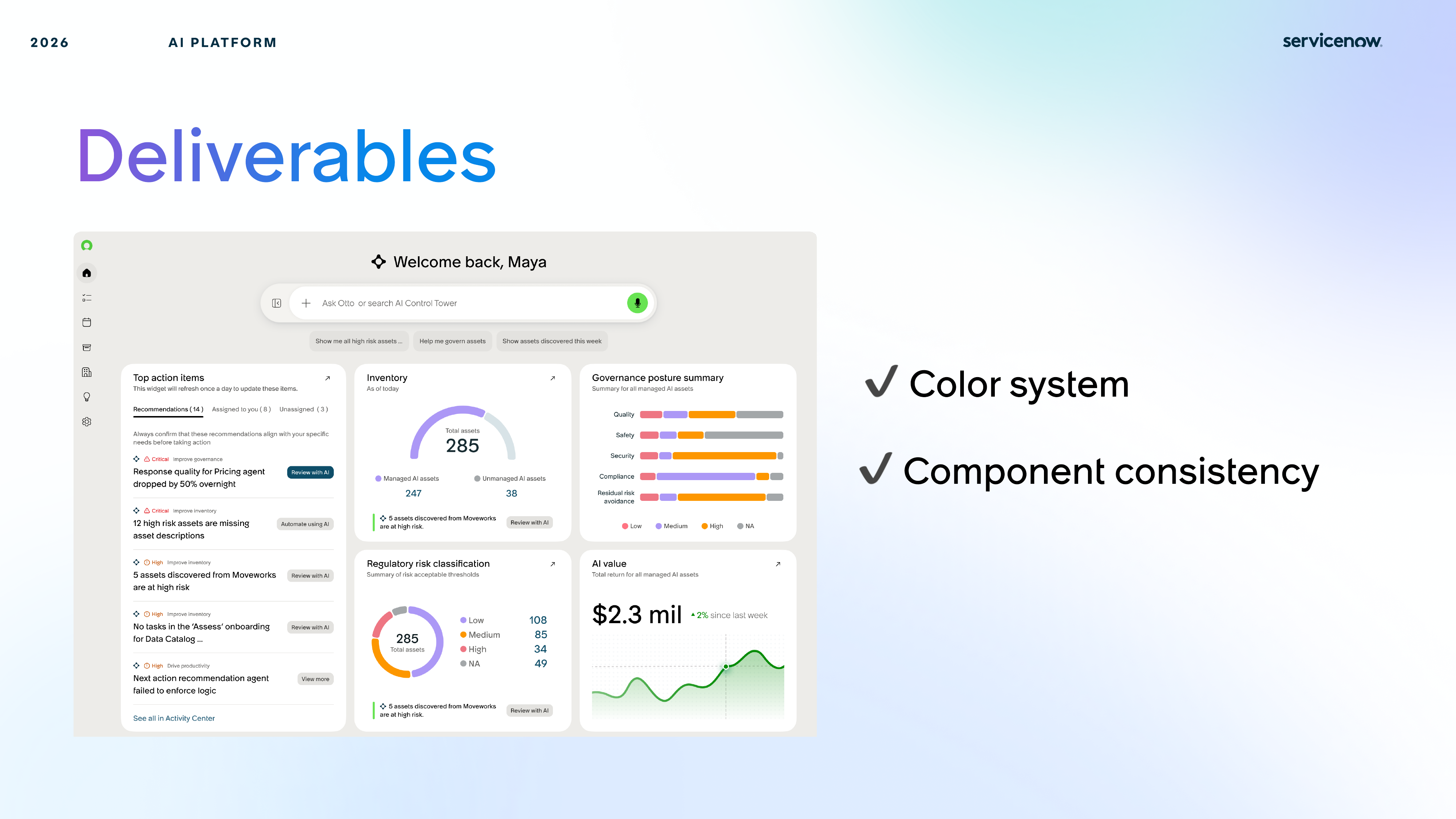
Shared treatment across cards, data visualization, and layout created a more unified product rhythm.
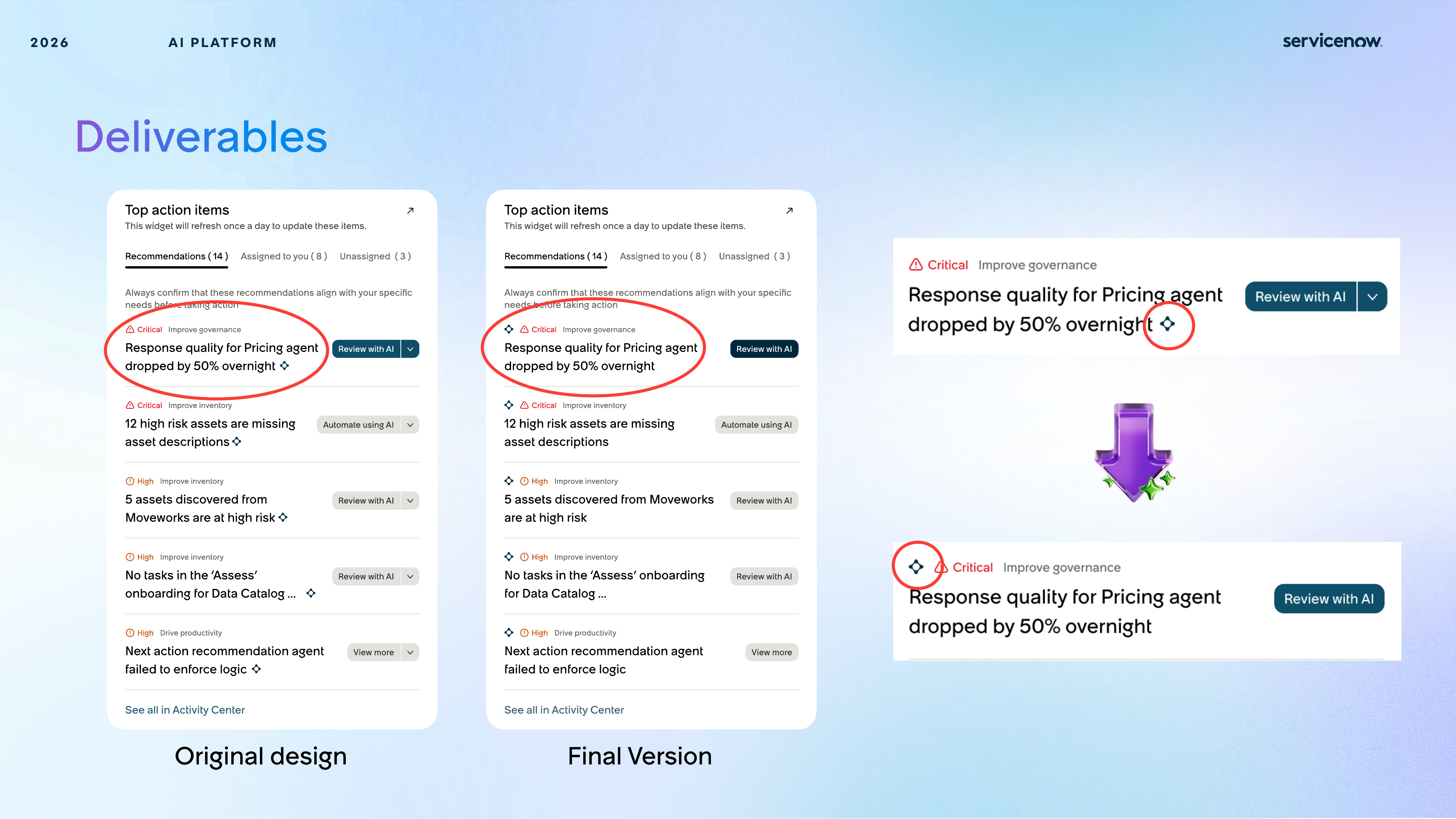
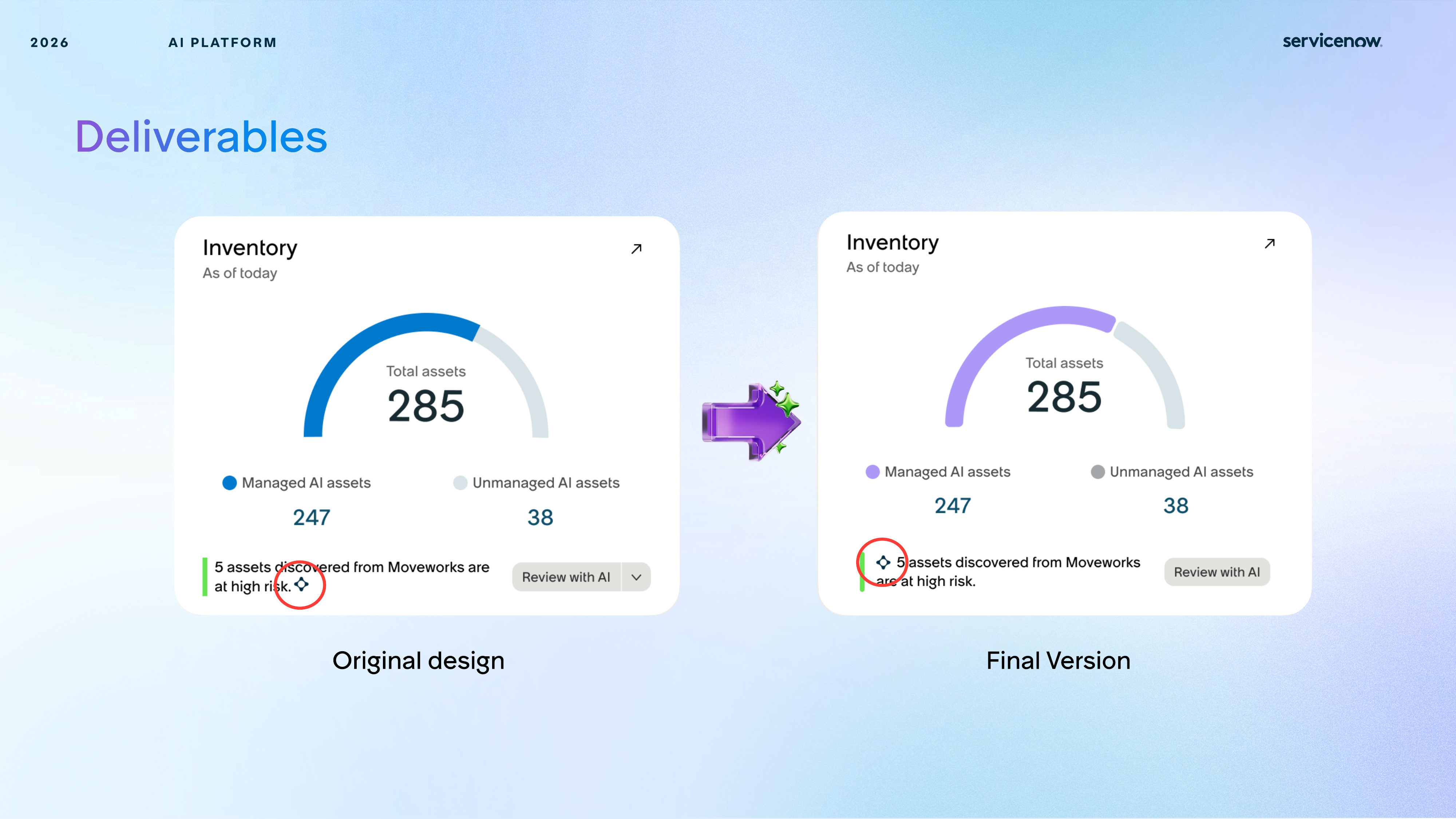
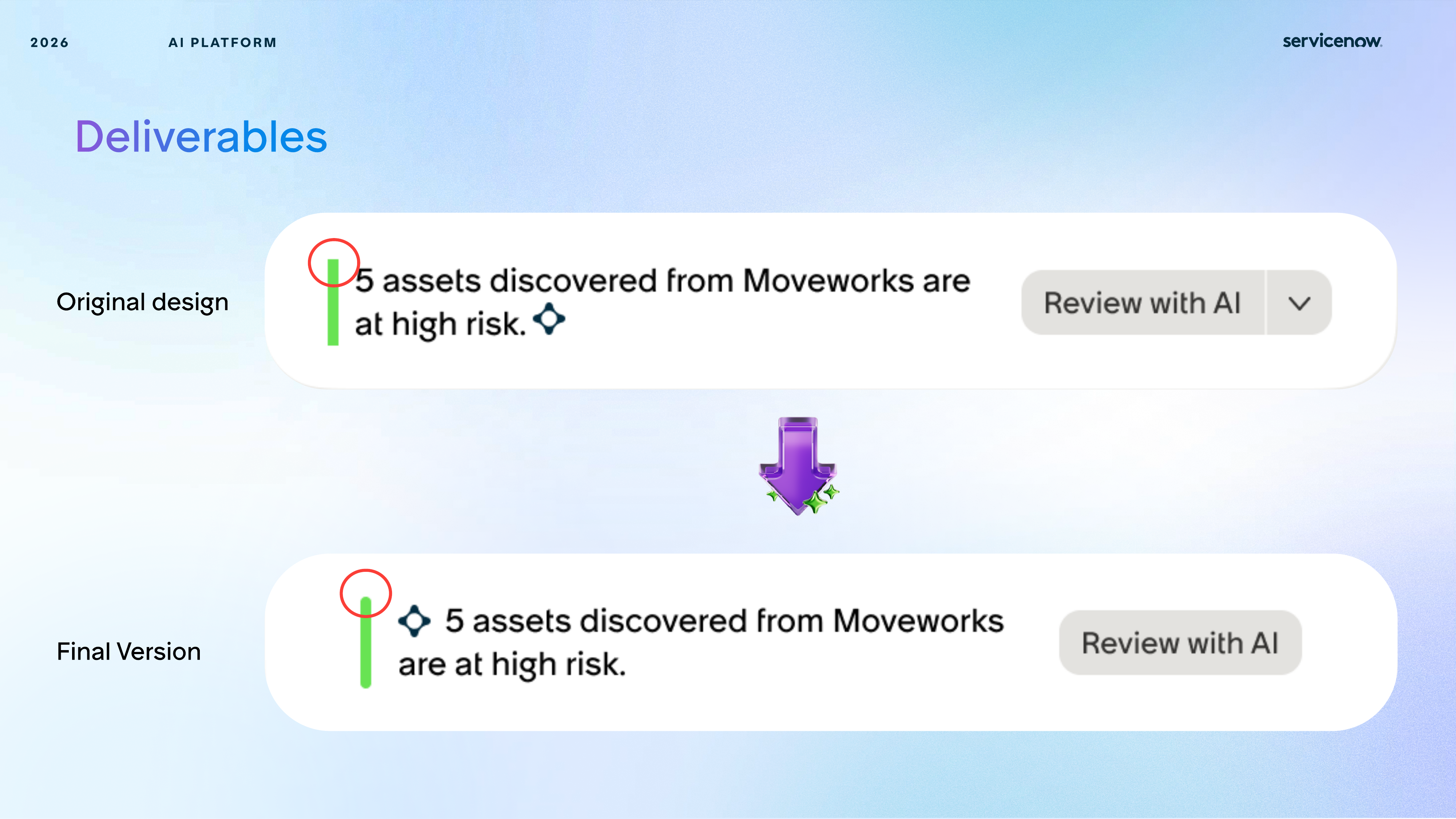
Subtle AI-specific visual cues improved immediate recognition without breaking the platform's enterprise tone.
The system was designed to hold up across dashboard, inventory, governance, and future AI oversight modules.
Deliverables
The project translated principles into direct interface changes: cleaner charts, stronger emphasis, clearer state differences, and more consistent visual behavior across dashboard components.
Reflection
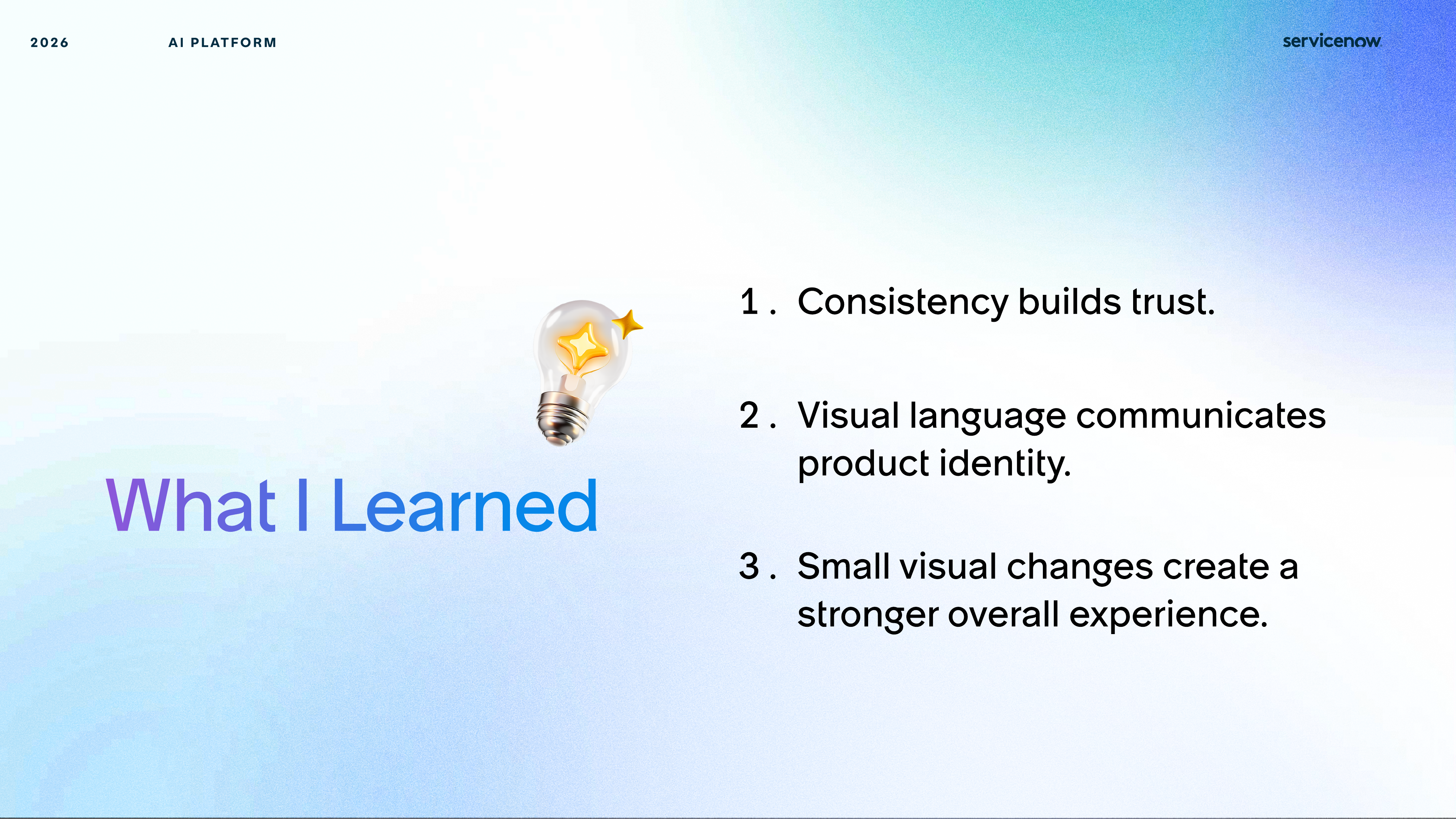
The final learning from this project was that consistency is not just polish. In AI products, consistency helps users trust what they are seeing, and visual language becomes part of how the product communicates intelligence and reliability.
When data, charts, and cards align visually, the product feels more dependable and easier to interpret.
A clearer AI-specific system helped AI Control Tower feel more intentional and recognizable as its own experience.
Subtle hierarchy, chart, and color refinements made the interface feel more coherent without requiring a full redesign.